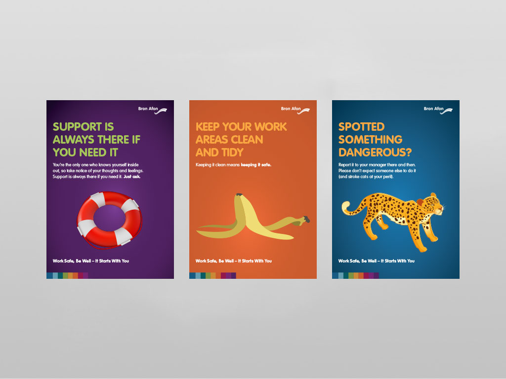
"It Starts With You" Health and Safety Campaign.
The main aim of the poster and leaflet campaign was for them to be catchy and impressive to ensure that the key message is read. Health and safety notices can often be heavy and boring, but they play a vital role in keeping workers safe. Here we took 9 key messages and made them into an interesting series that could be very easily read and understood. It was suggested that using humor would be a good way to attract attention, and attract staff to read the communication. After coming up with some draft ideas, the communications team were happy for us to go ahead.
The organization had recently been rebranded, but apart from the resulting new logo, it didn't have many house styles to help promote a cohesive brand. Our initial poster project established a bright bold use of color with simple typography and bold, yet simple illustrations.
These posters were designed in two formats: portrait shaped prints to be displayed in Bron Afon's various offices, and in each of the suppliers their staff use (mainly Travis Perkins). The second format was a wider animated television format to be shown on rotation in the offices.

Health and Safety Leaflets
The leaflets displayed next to their respective poster give more information and also where to find resources.

Easy to Read Tenancy Agreement
This was a later project that Webber Design worked on with Bron Afon. They wanted a copy of their tenancy agreement that would be easy to read for neurodiverse tenants. Large format text alongside supporting vector illustrations to convey a clear message. The final document was in a tilt and turn format as it was required to be in Welsh and English, keeping the languages separate was the best way to keep it easy and clear for tenants to understand.


We have maintained a great working relationship with the Bron Afon team after the initial project and have continued to work together since, on projects including:
- Annual Report 2020/21
- DLO Forum Poster
- Driving Safety Posters
- Tenancy Agreements (Easy to Read)
- Recruitment Packages
- Risk Cards
- Sickness and Absence Policy Documents
- SMT Briefing Slide Deck
- Van Fleet Operation


